Preface.
–
シンボルマークの制作にあたり、まずは料理をご馳走になる機会をいただいた。まだレストランは施工前で、オーナーシェフの青木虎太郎氏の自宅に招かれた。
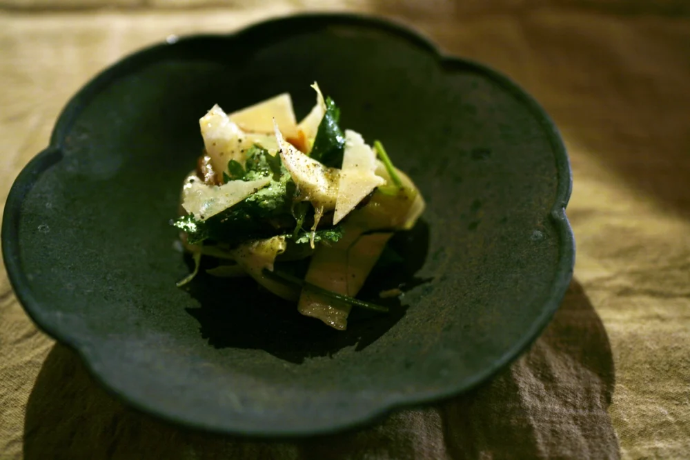
山形から持参したのは、前日に採れたクロラッパタケ。仏語では Trompette de la mort(死者のトランペット)と呼ばれ、地面から黒いラッパが立ち並ぶように生える姿が印象的なキノコである。ほのかに甘いミルクのような香りがあり、私の好きなキノコの一つだ。そんな話を交えながら、ソムリエの川合海斗氏と食卓を囲んだ。今回の縁をつないでくれた千東和希氏は残念ながら席にはいなかった。
席上で語られたのは「素朴な贅沢」という言葉だった。青木氏は、家業のベーカリーを受け継ぎながらレストランを加えた店舗を構想しているという。子どもの頃、前川國男邸の前で遊び、その建築や家具に強く惹かれた経験がある。大人になってから、その特別さを「贅沢」として理解し、同時にそれが生活という「素朴」の中に潜んでいることを感じた。その経験を、店の環境やチームの着想源としたいと考えているそうだ。
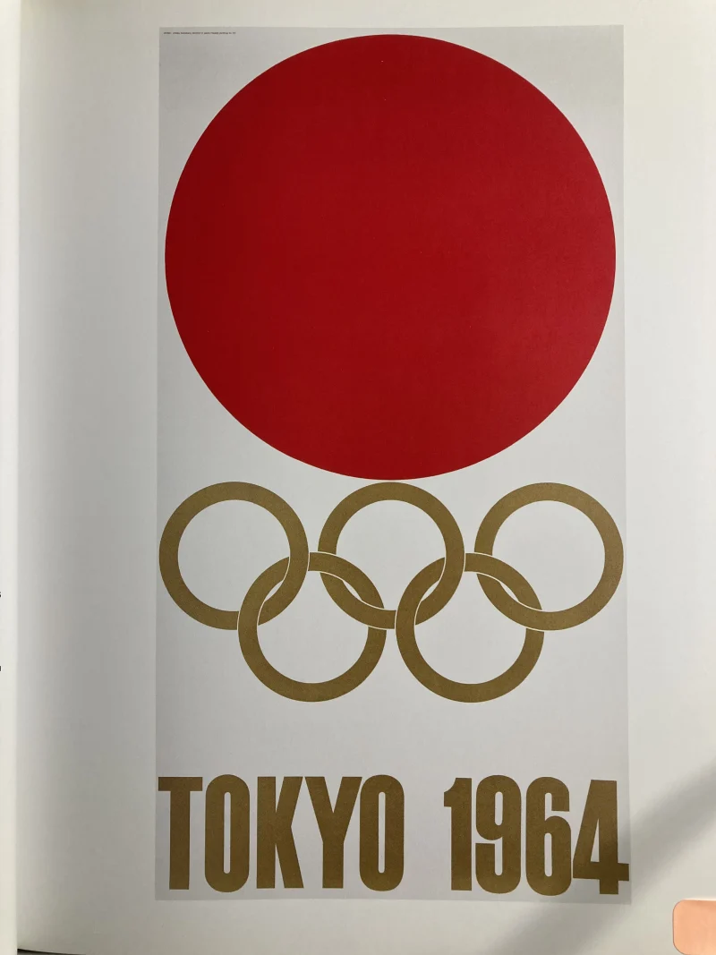
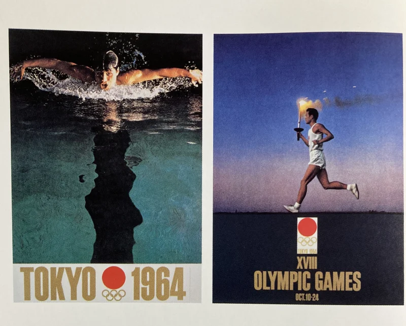
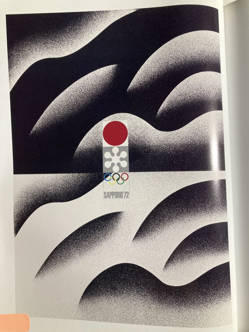
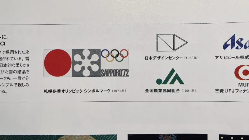
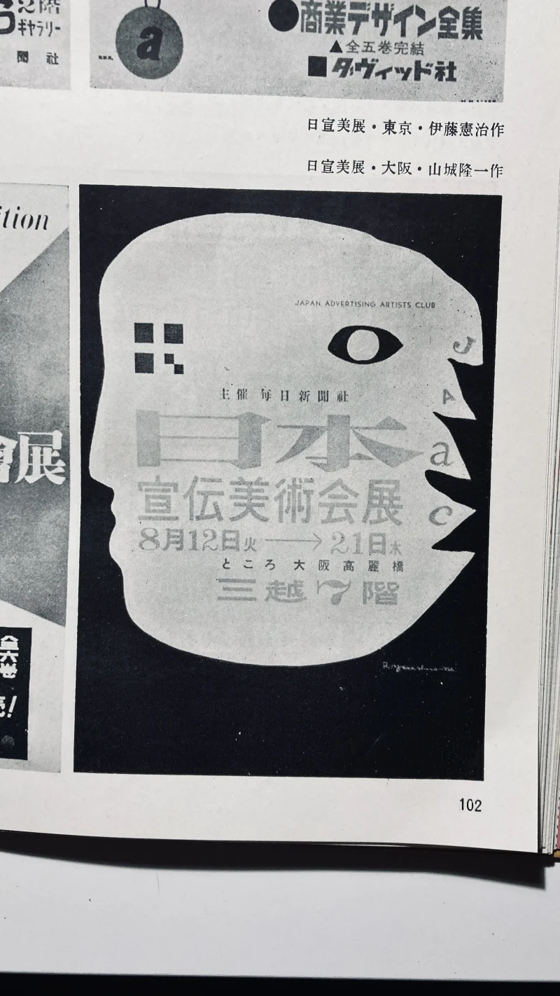
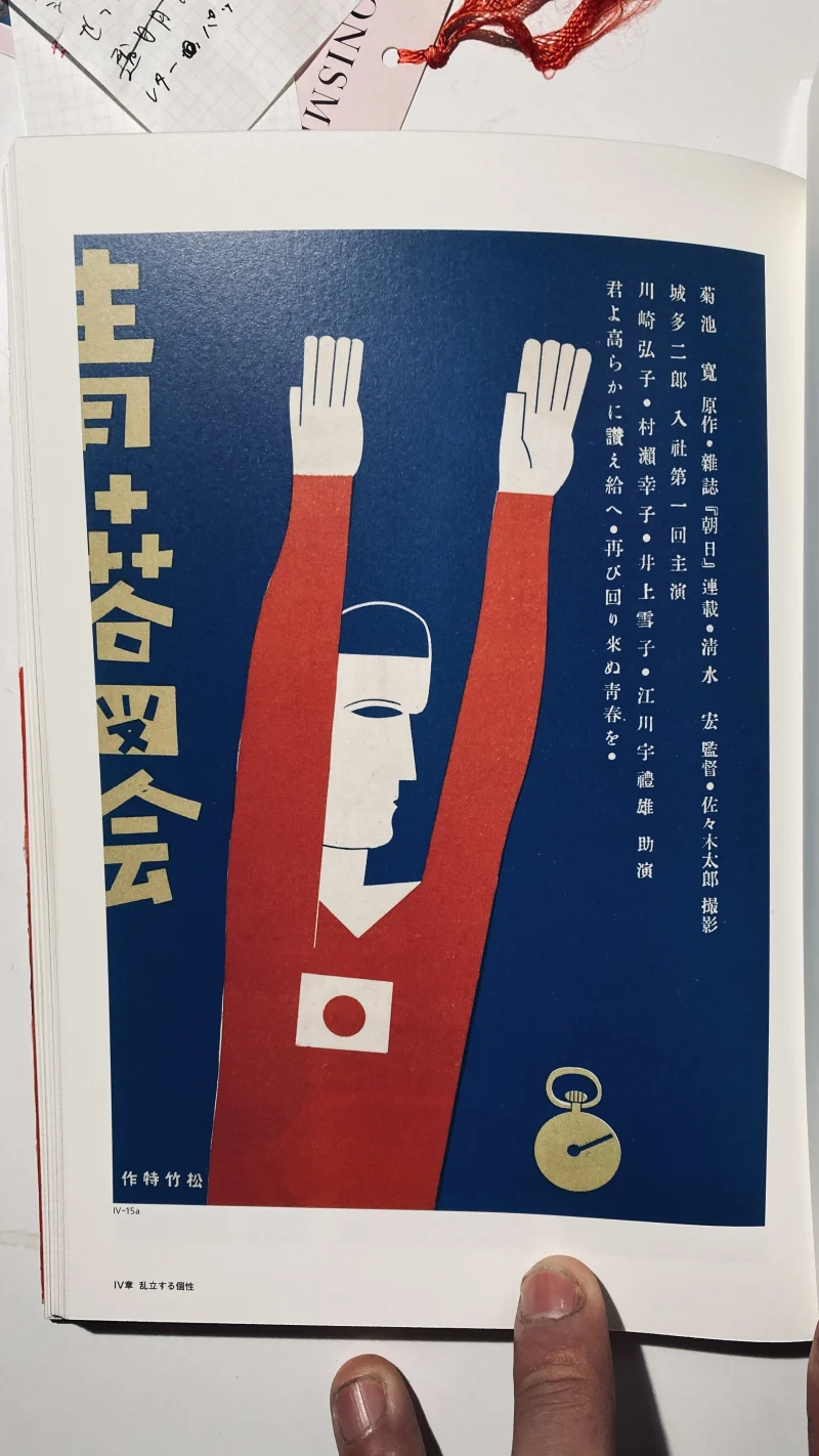
亀倉雄策の1964年東京オリンピック1号ポスターを例に挙げ、赤い丸、エンブレム、タイプフェイスという三要素を、それぞれレストランのシンボルマーク、ベーカリーのシンボルマーク、共通のタイプフェイスとして展開する構想も語られた。
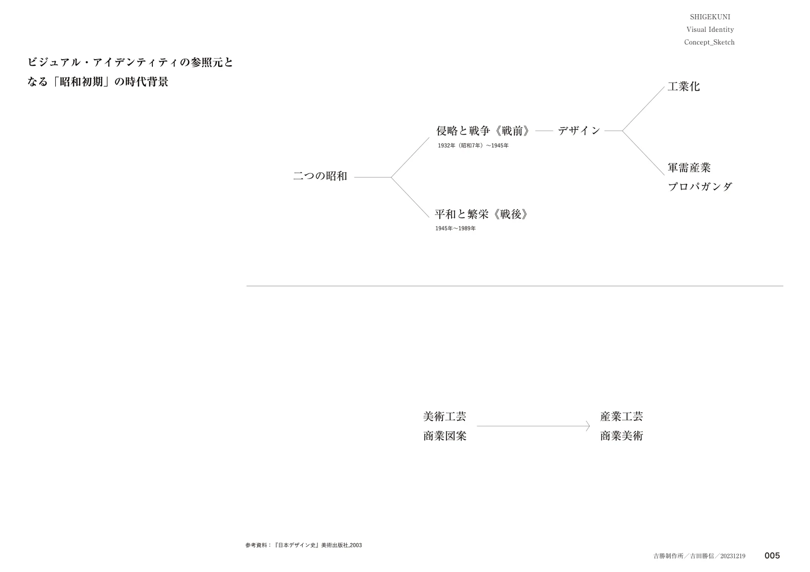
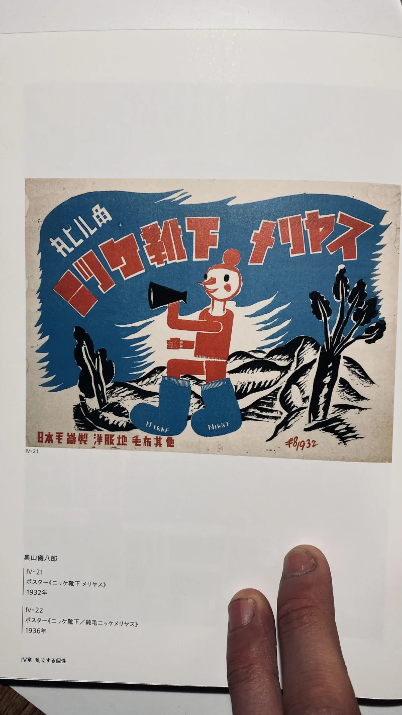
デザイン史を振り返ると、昭和初期は大きな影響をもった時代である。1932年から1945年にかけての「侵略と戦争」の時代には、デザインは工業化や軍需産業、プロパガンダと結びつき、1945年から1989年にかけての「平和と繁栄」の時代には、復興と経済成長の中で新しい展開を見せた。美術工芸や商業図案から産業工芸や商業美術への移行もそこに含まれる。
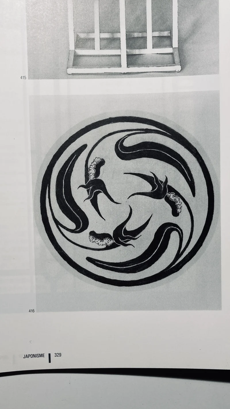
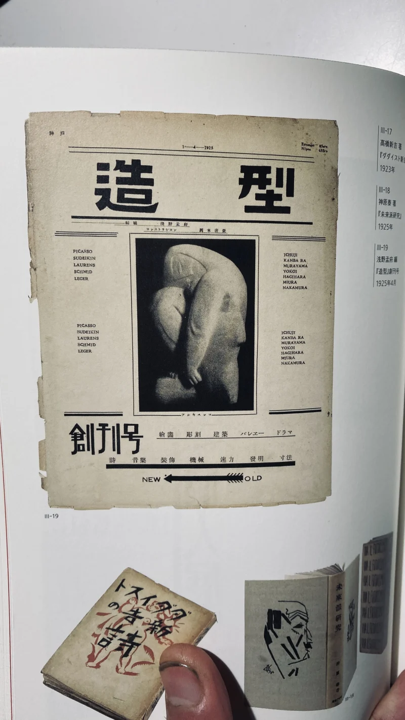
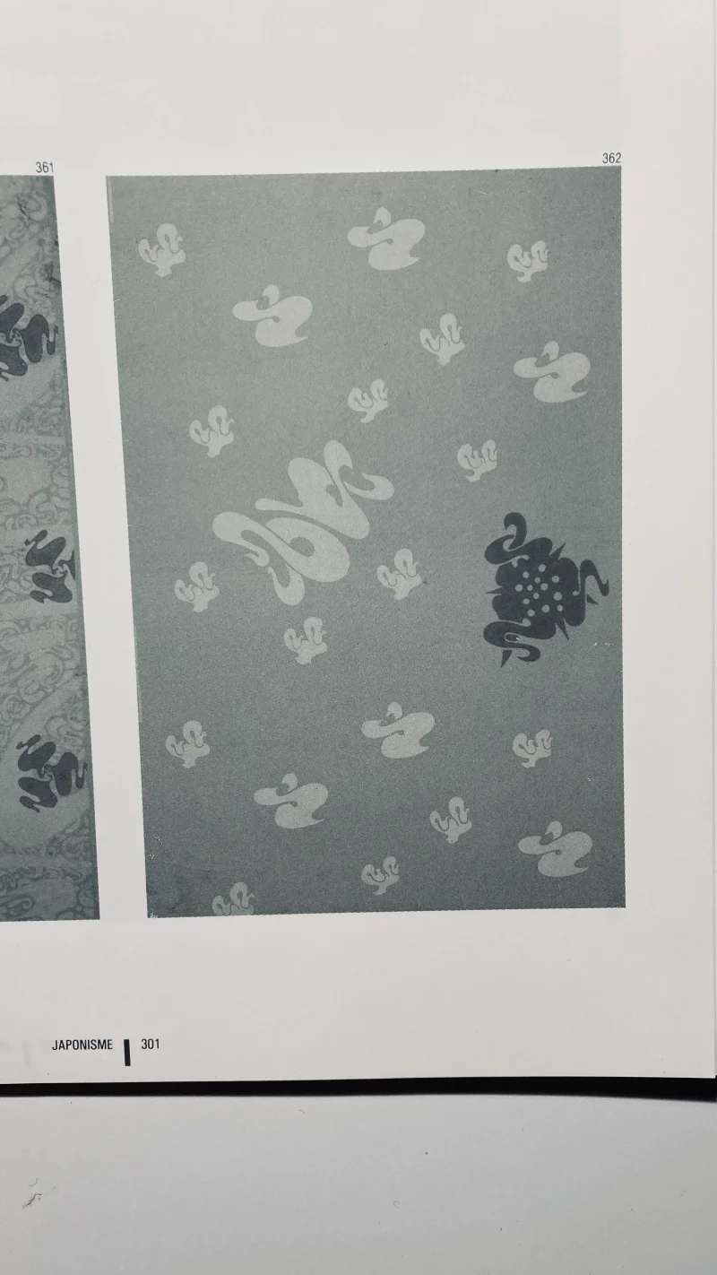
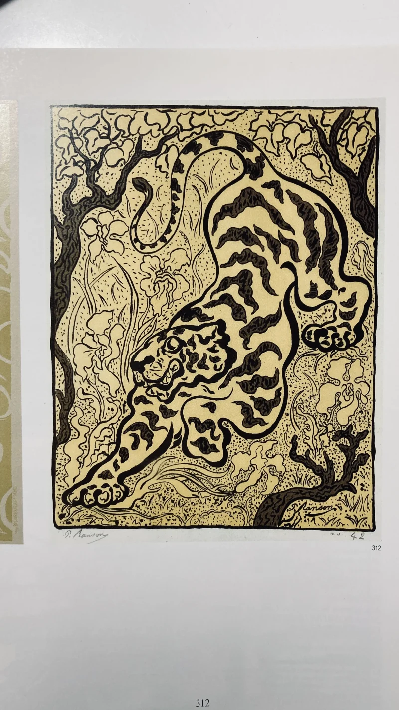
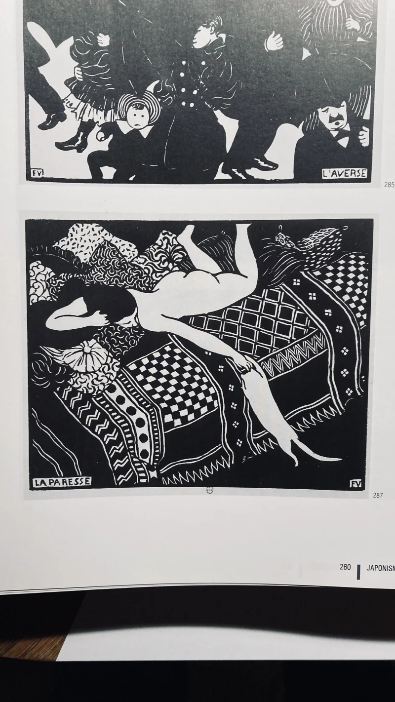
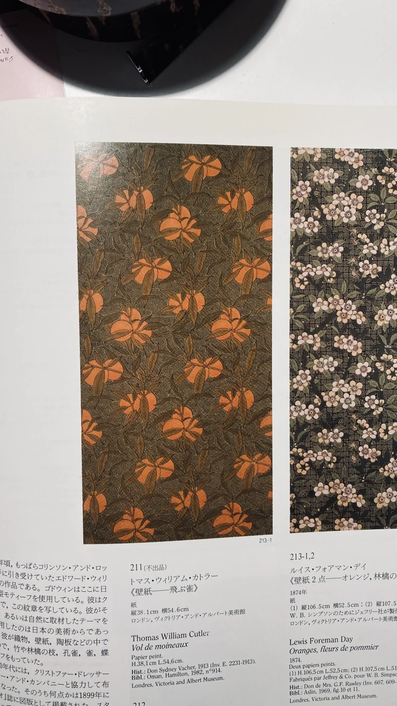
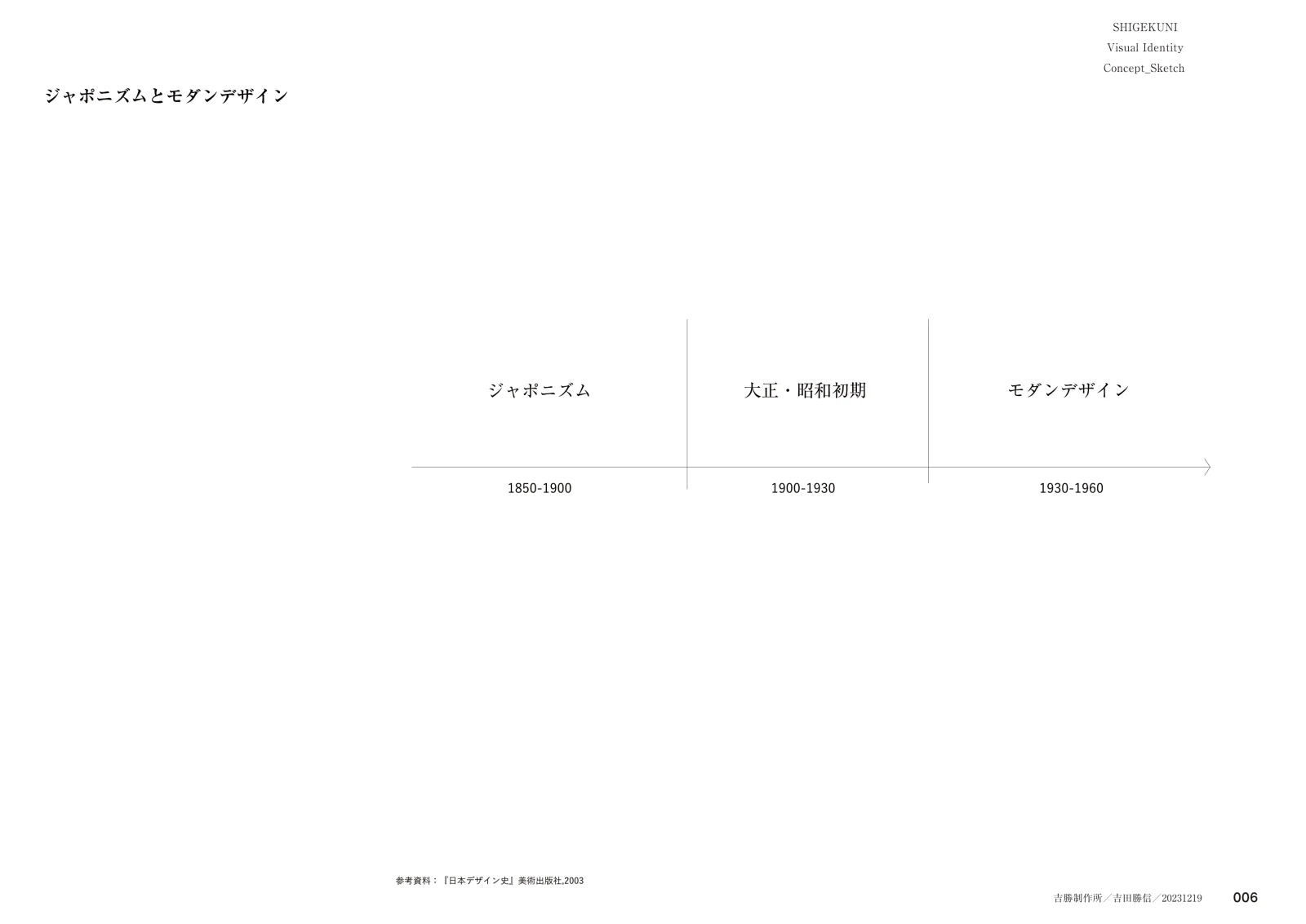
さらに、1850から1900年に広まったジャポニスム、1900~1930年の大正・昭和初期、1930から1960年のモダンデザインという流れをたどると、昭和初期は二つの様式に挟まれた時代といえる。
この昭和初期を参照しながら現代へつなげるとき、その「混ざり方」が重要になる。西洋料理の技法や文脈を日本に実装する際、必ず日本の文化と交わるように、歴史的にも西洋料理はすでに日本で独自に混ざり合ってきた。料理はその土地の人が食べるものであり、技術や文脈をそのまま移植することはできず、自ずとローカライズされていく。
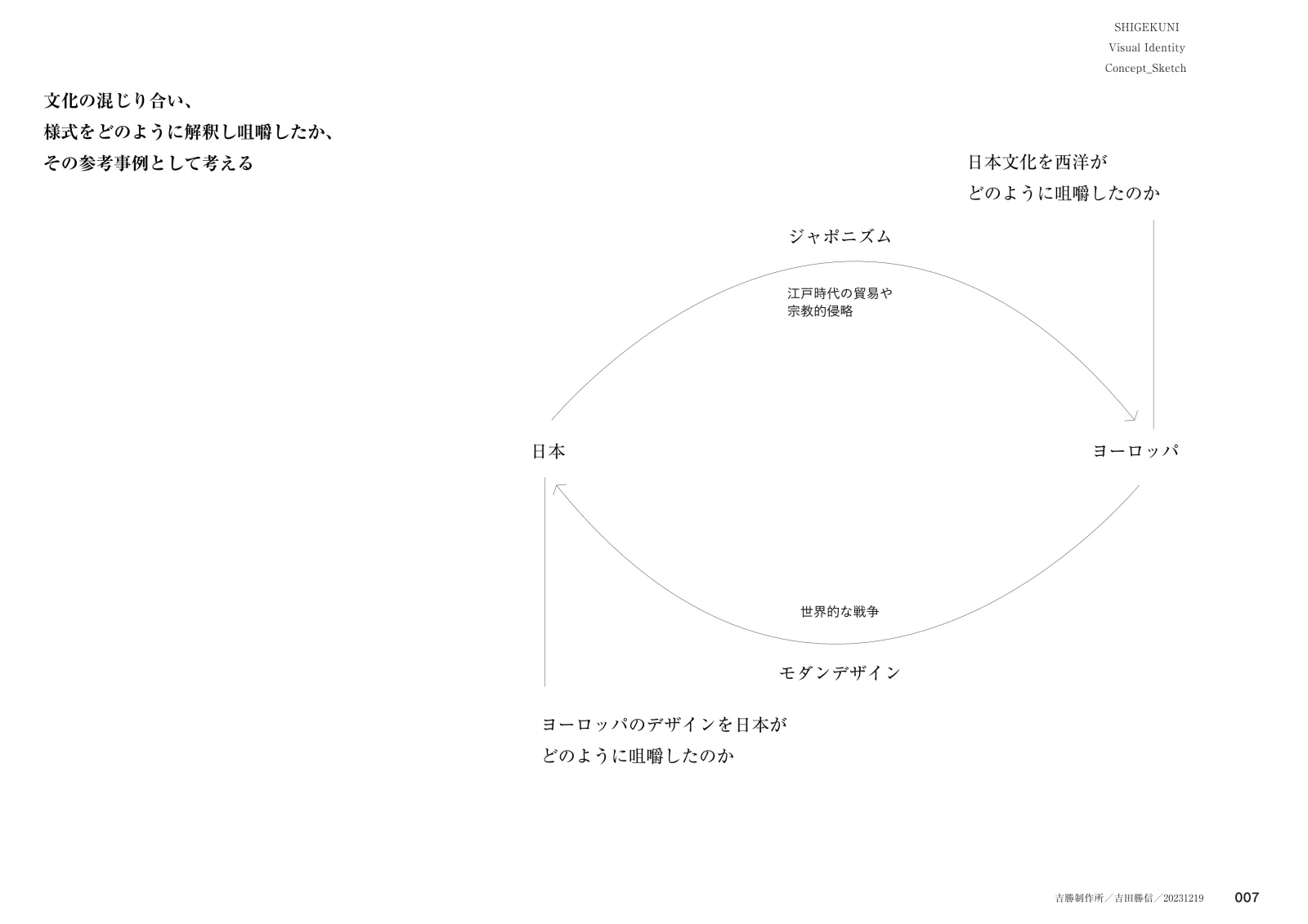
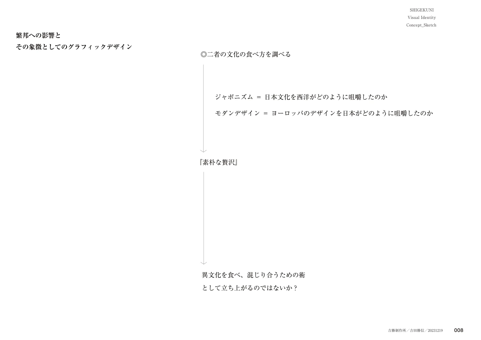
今回はこの「文化のローカライズ」を一つの視点とした。「素朴な贅沢」という異なる二つの言葉が合成されたように昭和初期が挟まれた二つの様式を参照した。西洋が日本文化をどのように咀嚼したのか、また日本がヨーロッパのデザインをどのように取り入れたのかが重要な視点とされる。江戸時代の貿易や宗教的侵略を背景にジャポニスムが広まり、世界的な戦争を経てモダンデザインへと展開し、日本は再びヨーロッパのデザインを咀嚼し直していった。この往復的な関係は、文化解釈と翻訳の具体例とみなすことができる。その二つを再合成し、現代へ継承してゆくときグラフィックデザインが立ち上がるのではないかと考えた。
–
In preparing to create the symbol mark, I was first invited to share a meal. Since the restaurant was still under construction at the time, I was welcomed into the home of the owner-chef, Mr. Kotaro Aoki.
As a gift, I brought kuro-rappatake, harvested the previous day in Yamagata. In French it is called Trompette de la mort (“trumpet of the dead”), a mushroom whose striking form rises like black trumpets from the ground. With a faint, sweet fragrance reminiscent of milk, it is one of my favorites. Sharing this story over the meal, I sat at the table with sommelier Mr. Kaito Kawai. Unfortunately, Mr. Kazuki Chihigashi, who had arranged the appointment with Yoshikatsu Seisakusho, was not present.
At the table, the phrase “simple luxury” became the theme of discussion. Mr. Aoki explained his vision of carrying on his family’s bakery business while also adding a restaurant. As a child, he often played in front of the residence of architect Kunio Maekawa and was deeply impressed by its architecture and furniture. Later, as an adult, he came to understand that sense of distinctiveness as a form of “luxury,” and simultaneously recognized that such qualities could be found hidden within the everyday—what he called the “simple.” He hoped to make this experience the source of inspiration for the restaurant’s environment and team. He also referred to Yusaku Kamekura’s first poster for the 1964 Tokyo Olympics, breaking it down into three elements—the red circle, the emblem, and the typeface—and envisioned transforming them respectively into a symbol mark for the restaurant, one for the bakery, and a shared typeface across both.
Looking back at the history of design, the early Shōwa period was an era of significant influence. From 1932 to 1945, during the years of “invasion and war,” design was closely tied to industrialization, the military industry, and propaganda. From 1945 to 1989, in the era of “peace and prosperity,” it developed anew within the context of postwar recovery and economic growth. This period also saw transitions from fine crafts and commercial illustration to industrial crafts and commercial art.
Moreover, tracing the lineage from the spread of Japonisme between 1850 and 1900, through the Taishō and early Shōwa periods (1900–1930), and into Modern Design between 1930 and 1960, the early Shōwa era can be seen as one positioned between two distinct styles.
When referencing the early Shōwa period while seeking to connect it to the present, the way in which different elements are “blended” becomes crucial. Just as Western culinary techniques and traditions inevitably merge with Japanese culture when practiced in Japan, so too has Western cuisine historically undergone its own process of adaptation within Japan. Food is always consumed by people rooted in a particular place; it cannot be transplanted wholesale, and thus is inevitably localized.
For this project, I took “cultural localization” as a key perspective. In the same way that the words “simple” and “luxury” are combined, the early Shōwa era may be understood as a point of connection between two styles. The questions of how the West digested Japanese culture, and how Japan, in turn, absorbed European design, are central here. Against the backdrop of Edo-period trade and religious incursions, Japonisme spread, followed by the global wars and the subsequent rise of Modern Design, during which Japan once again reinterpreted European design. This reciprocal process can be regarded as a concrete example of cultural interpretation and translation.
By recombining these two elements and carrying them forward into the present, I came to think that graphic design might emerge anew.