Preface.
–
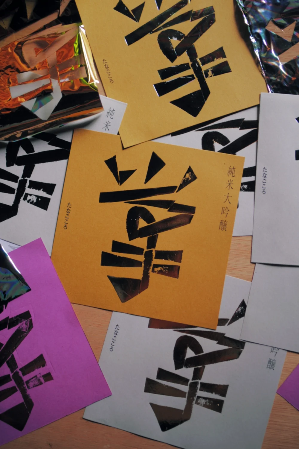
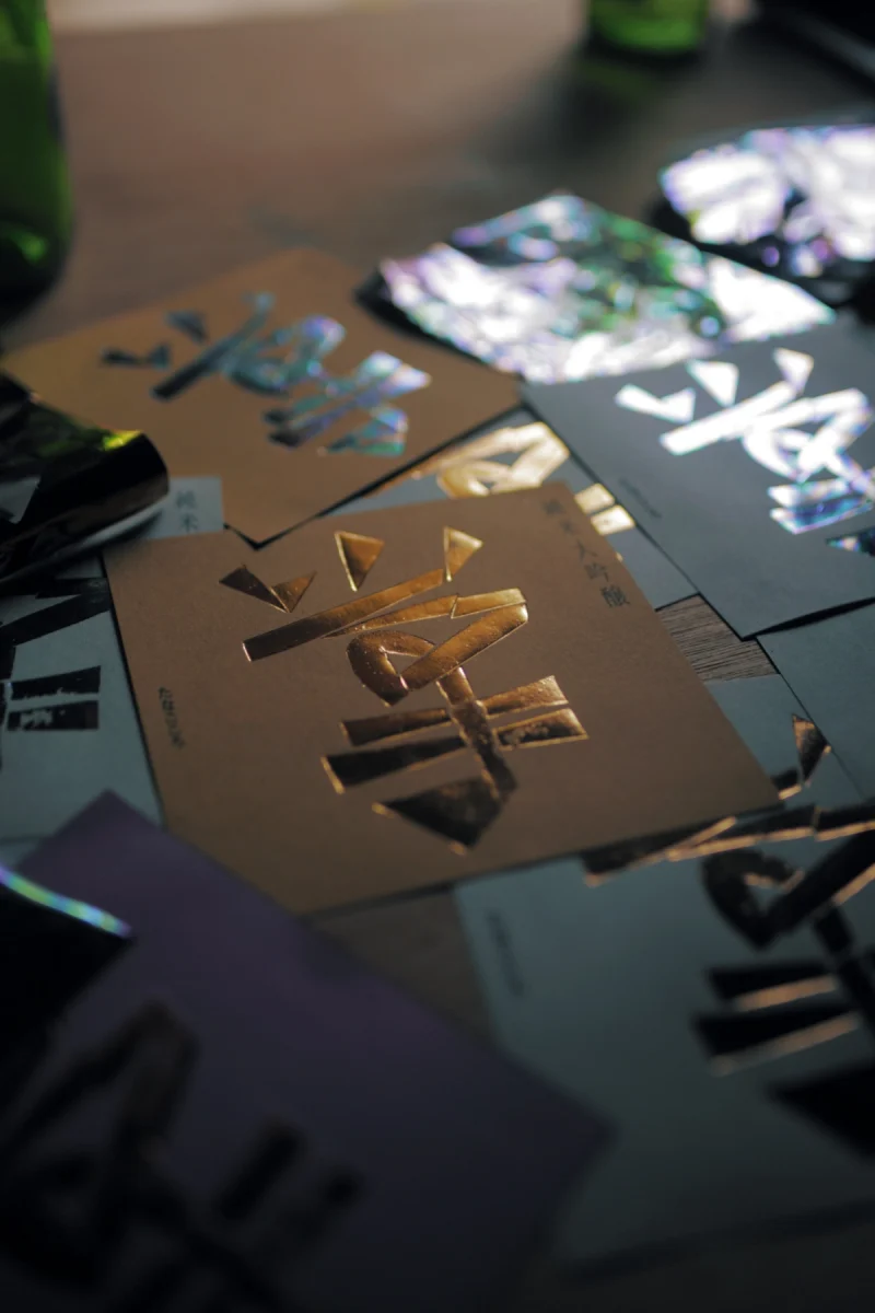
近所の酒店が付き合いのある酒造へ特注している日本酒「掌」のためのラベル。その酒名をそのまま図案にする依頼だった。
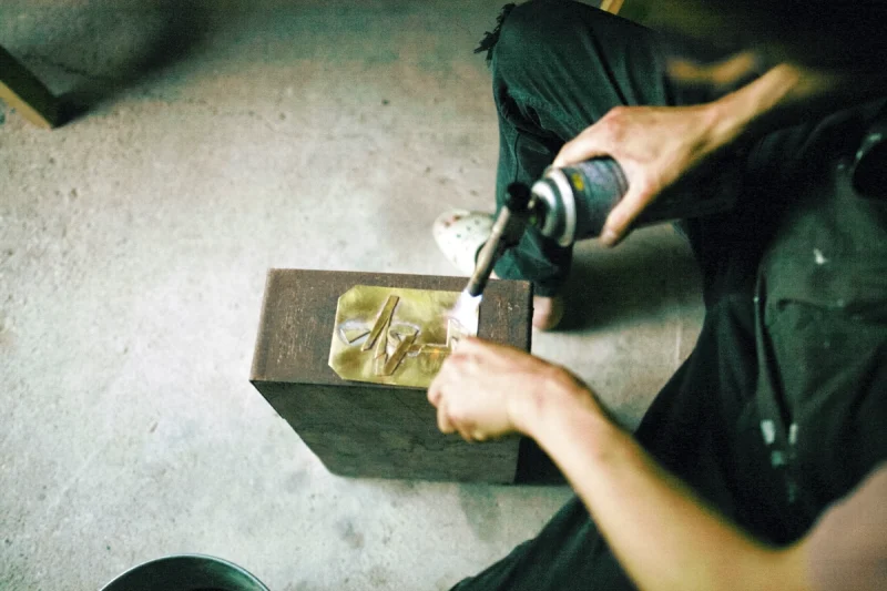
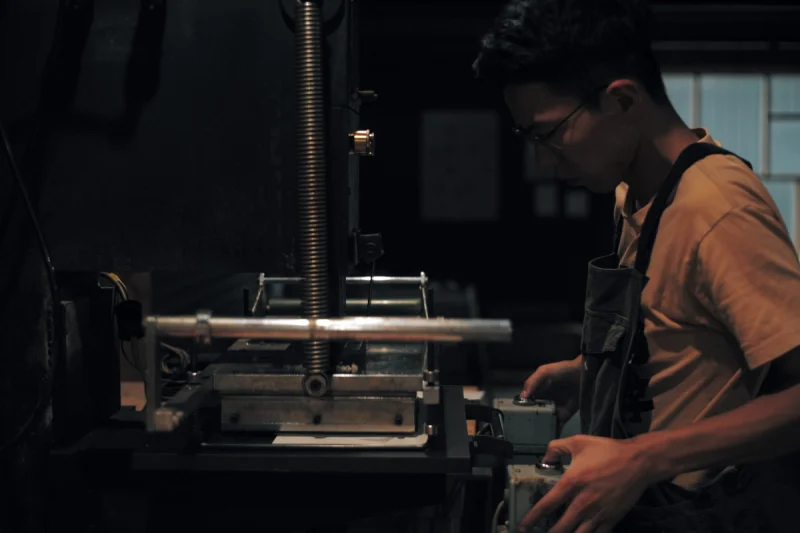
依頼主は、うまい日本酒が呑みたいときに酒を買いに行く店の店主で、「発注」というよりはその場の「問答」のようなかたちで始まった仕事。かなり良い酒らしく、作る本数は200本ほど。それくらいのラベル枚数だと印刷所に頼むのもコストが高くなる。かといって家庭用プリンタでは安っぽくなる。そこで、以前に縁あって入手した箔押し機を使うことにした。
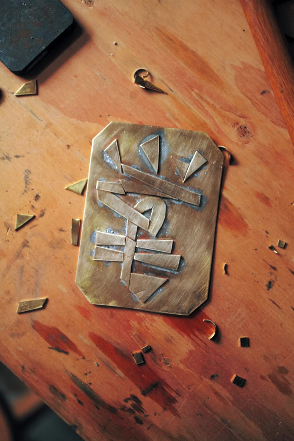
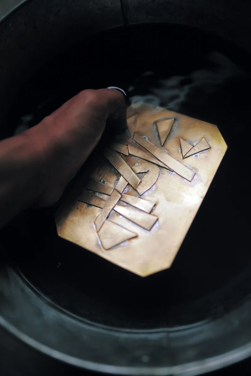
まず『五体字類』などを参考に「掌」の字形をスケッチし、紙で実寸の版をシミュレーション。そのうえで2mmの真鍮版をハサミで切り、出てきた素材を文字の形に並べて版をつくった。金属の板は硬くて思い通りの形にはならないが、そこに面白さや味わいが生まれる余白があった。
–
A label for the sake Tenohira (“Palm”), specially brewed by a local brewery at the request of a neighborhood liquor shop. The commission was to turn the name itself into a design.
The client was the shop owner from whom I usually buy sake when I want something good to drink. It began less as a formal “order” and more as a kind of impromptu dialogue. The sake itself was of high quality, with only about 200 bottles produced. For that small a number, having the labels printed professionally would be costly, yet printing them at home would look cheap. So I decided to use a foil stamping press I had obtained through a connection some time earlier.
First, I sketched the character 掌 (“tenohira,” palm) while consulting references such as Gotai Jirui (A Compendium of Chinese Characters), and simulated the plate at actual size on paper. Then I cut 2mm brass plates with shears, arranging the pieces into the shape of the character to make the printing plate. The metal was too hard to cut exactly as I wished, but within that resistance lay a margin that produced interest and character.