Preface.
–
目醒めのコーヒー
2015年以降、山形市のローステリア「ISKOFFEE」と「sui-cafe」に、グラフィックやパッケージ、サイン計画、サービス設計、運営の相談役として継続的に関わっている。出会いは私が大学を中退し、仲間と小さなカフェを始めた頃に遡る。提供する豆を探して街を歩き回り、たまたま辿り着いた店でオーナーの山口氏に出会った。はじめての仕事は「sui-cafe」のパンフレット。その仕事がお互いに楽しくて、単発の受発注ではなく継続的に関われないか議論した。私の報酬を「社長給与の一〇%」とし、全メンバーが集う定例会を運営し、合意形成と意思決定を支える――役割は明確で、線引きはシンプルだが、その内側で扱う情報は生活の温度を帯びている。焙煎の具合、天候、客の流れ、レジ横の動線、誰がどこでつまずくのか。そうした細部に耳を澄ませるところから、第二店舗「ISKOFFEE」の立ち上げは進んだ。
コーヒーにはいくつもの起源神話が語り継がれている。たとえば、赤い実を食べたヤギが夜通し眠らず、困った飼い主が寺院に相談した。それがきっかけとなり瞑想の薬として重宝されたという話。歴史的な真偽はさておき、修道における覚醒の道具であったこと、そして十四世紀のヨーロッパでコーヒーハウスが階層を越えて人々を招き寄せ、議論と創発の場になったことは確かだ。山口氏と私が共有したのは、コーヒーを「休憩の飲み物」としてだけでなく、思考を活性化し日常を創造的なものへ覚醒させる「目醒めのコーヒー」として位置付け、ブランドの核に据えた。
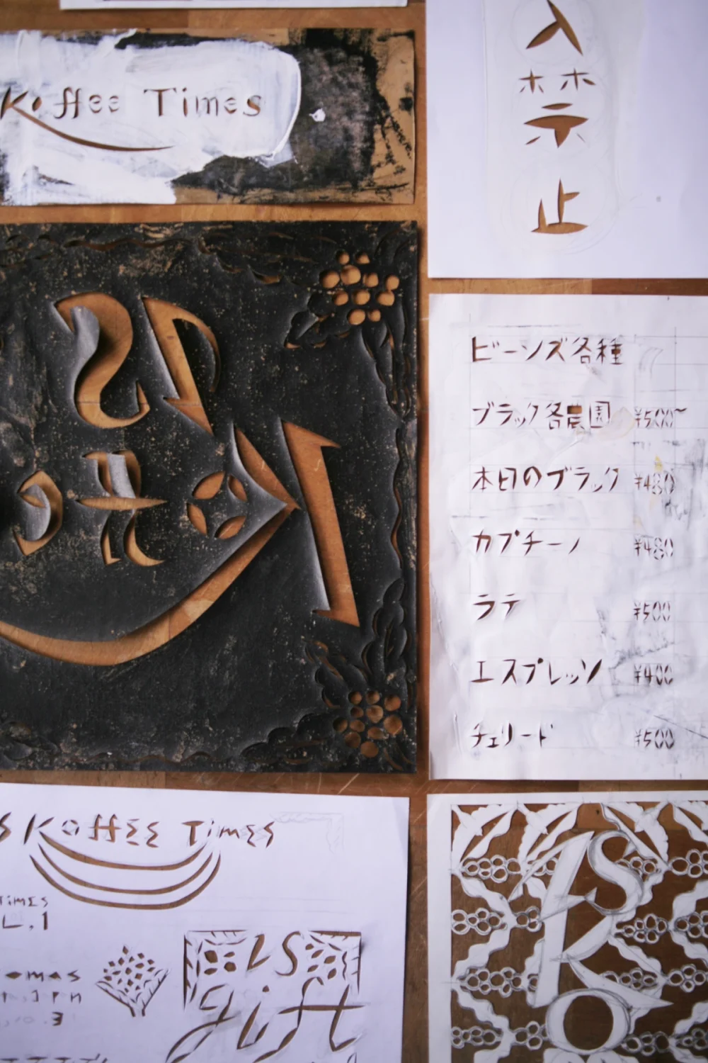
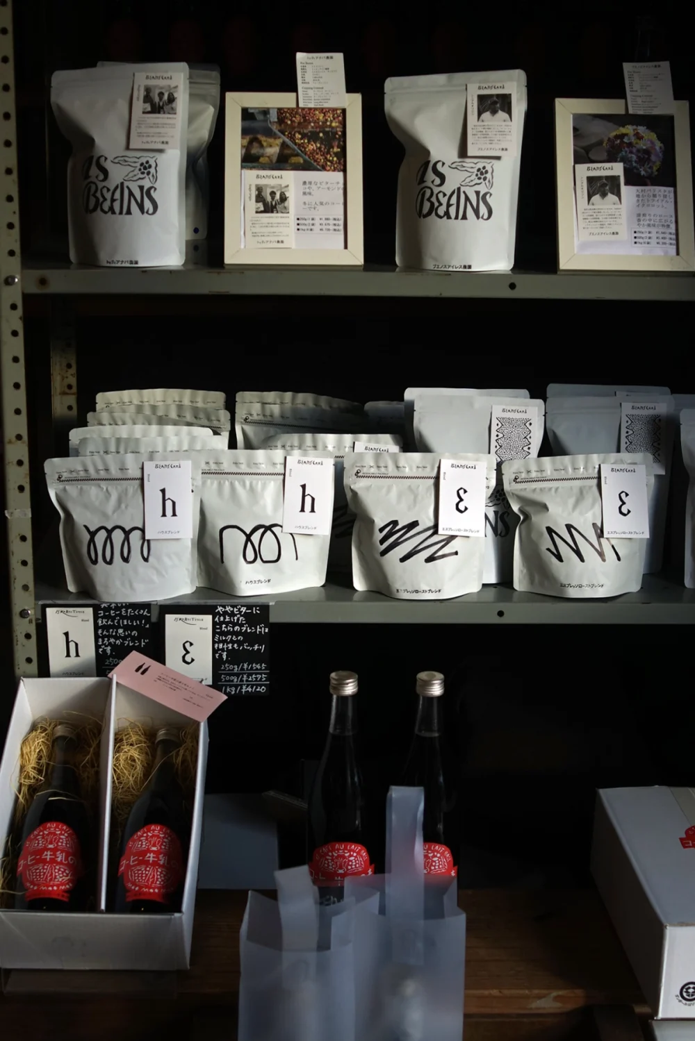
ローステリアの仕事は長い連鎖を成す。赤道直下の産地へ赴き、数十の農園でカッピングを重ね、納得のいくロットを買い付ける。日本に戻れば、焙煎の温度域を探る地道な反復が始まり、豆の性格を崩さずにひらくポイントを手仕事で掴んでいく。パッケージは、運ぶ・並べる・選ばれるための装いであると同時に、この長い連鎖の気配を残す媒体でもあるべきだ――そう考え、私は実家の染織工房で身につけた「型染め」をグラフィックに持ち込んだ。渋紙を彫り、糊や染料をヘラで押し出す。印刷でいえば製版に当たるが、実際には版の手触りや小さな逸脱がそのまま画面に残る。同時に、早い段階でシンボルマークやタイプフェイスを作らないことを提案した。サービスや商品は季節や社会の要請とともに変わる。変わり続ける運動体に紋章だけを先に与えるのではなく、制作物の反復と蓄積が自ずと「像」を結び、結果としてビジュアル・アイデンティティが自生する方が健全だと判断したからだ。
作り方を受け渡す、七〇%の複製性
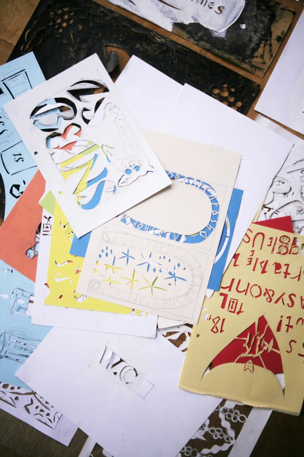
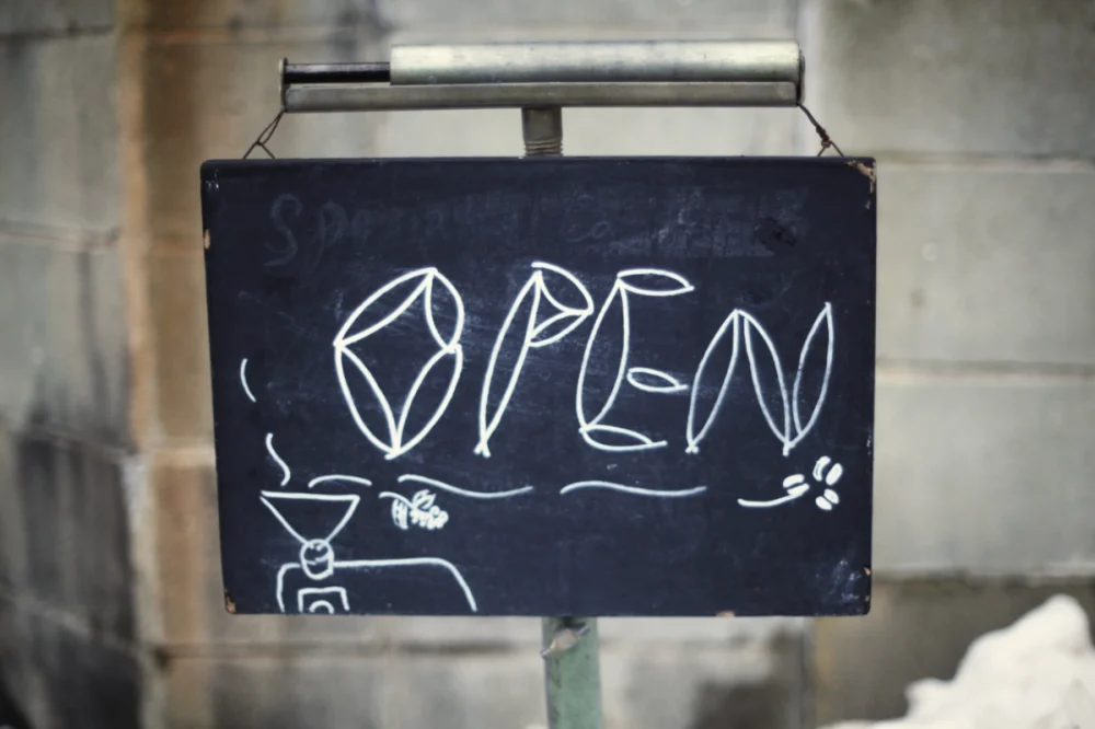
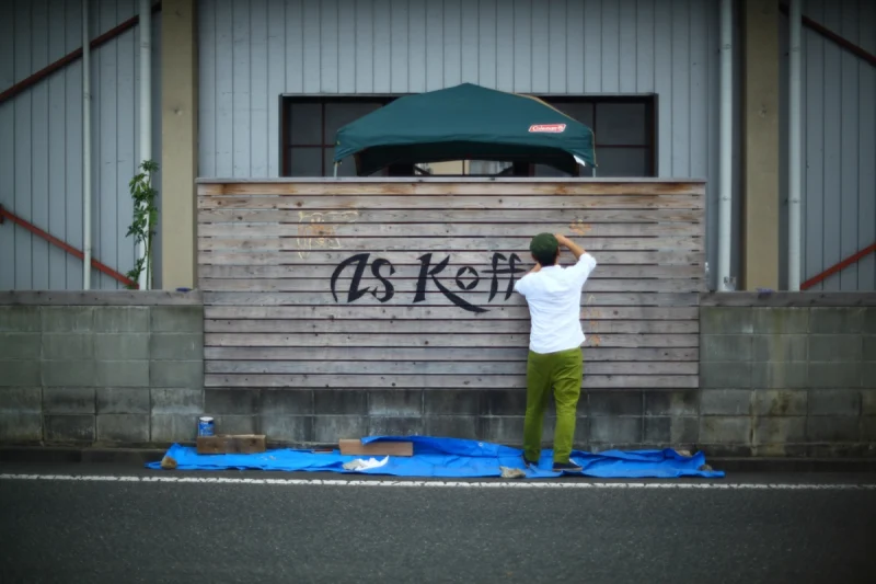
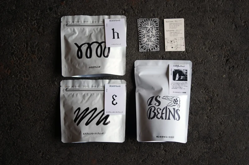
店のサインや看板は、外注せず自分たちで作ると決めた。紙で版を切り、壁や扉に直接刷る。道路に面した木壁は、私のスケッチをもとに全員で彫り、看板へと変えていった。内製の楽しさは伝播する。私が切り紙で作った文字や図案は、やがてスタッフの手描きポップに複製され、店内の視覚言語は「似ているけれど同じではない」表情を帯びはじめた。紙媒体は当初、手彫りの版で刷ったが、原版が増えるにつれ、既存の切り紙を素材にデータ上で再編集し、ポイントカードや包装紙へ展開する流れが整った。
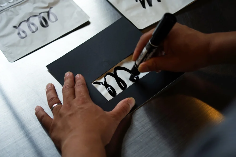
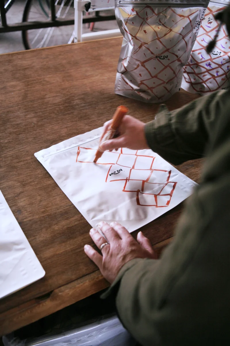
転機はあるパッケージだ。山口氏から「今日試しに焼いた豆を、今日のうちに棚に並べたい」という相談が来た。入稿・校正・納品という定石では間に合わない。要件は五つ――①デザイナーを介さず現場で完結、②外注印刷に依存しない、③誰でも再現できる、④歩留まりが良い、⑤店内で安全に作業可能。私は二つの「手で量産する」仕組みを設計した。
一つは直書き方式。白い袋と同寸の厚紙に窓を空けた治具を用意し、黒の油性マーカーで描く範囲を限定する。筆記用具となるマーカーはポップを描くのによく使っているものから選んだ。モチーフは、渦、湧き、余韻、果実の輪郭――風味の比喩としての一筆書き。1〜2時間の短いワークショップで描き方を共有すれば、その日から誰でも実装できる。もう一つは、家庭用プリンタで出力する汎用ラベルに、色だけで風味差を描き分ける方法。どちらも「工程を減らす」のではなく、「工程を現場へ移す」設計で、意思決定から陳列まで工程が店舗におさまることとなった。
ここで生まれるのが「七〇%の複製性」だ。描き手の理解の違い、右利き・左利き、筆圧や速度――身体や理解の差が模様に反映され、こけしの顔のように一体一体がわずかに違う。量産でありながら、一つ一つに個性がありつつも模様と模様の差はわかるくらいの帯域。
現代の工業的パッケージが目指すほぼ100%の一致から、あえて三〇%ぶん離れてみる。すると「失敗」という概念はやわらかく溶けていってしまった。インクのはね、線の震え、思わぬ余白――それらは失敗ではなく、手が通過した証拠として画面の密度を支え、失敗と成功の判断が非常に難しい。
私は制作の方法を二つの極として捉える。PC上で線を何度も引き直し、アールを一度刻みで詰め、コピー&ペーストを積層して精度を極める「積み上げ型」。もう一つは、写真の露光のように全体を一挙に掴み、後戻りのきかない運筆や彫りで仕上げる「全体掌握型」。郷土玩具の絵付け、陶器の筆致、書や木彫、古代の土器の文様――世界各地・各時代に連なるこの技法は、身体に宿る普遍的な術だと思う。
前者が論理の積分で像を結ぶなら、後者は身体の微分で像を立ち上げる。私たちの現場では、工程設計・価格設計・衛生やロス管理といった「積み上げ型」の足場を整え、その上で描く瞬間に「全体掌握型」を起動する。スピードと多様性、そして楽しさが両立する理由はここにある。
この視点をもう一歩進めると、「デザイナーを介さないデザイン」が見えてくる。基盤となる「作り方(構造)」を設計し、現場に手渡す。誰が描いても崩れず、しかし誰が描いても同じにならない作り方だ。結果として、デザインは「所有」ではなく「共有」へ移り変わっていく。
象徴的だったのは、オレンジの格子に点が入った新しいパッケージだ。山口氏が、これまで私が差し出してきた要素をブリコラージュし、自らの手で構成した。事後に「この案でいきたい」と連絡を受けたとき、私はすでに店頭に並ぶそれを見て、面白いことが起きていると思った。
相手の領分を理解しつつも現場の問いに対し「私(吉田)ならどう答えるか」を想像しながら手を動かす――その姿はもはや師弟関係である。一般的にクライアントとデザイナーは上下関係が出来てしまうことが多いらしいが作り方を受け渡したとき、その構造も転倒しはじめる。いよいよ「ISKOFFEE」のデザインは、私のものではなくなりつつある。
この文章は下記へ寄稿した文章を加筆修正したもの:
<寄稿> 吉田勝信.(2020).リレーコラム:若手デザイナーの眼差し 第95回 𠮷田勝信.Pdweb.http://www.pdweb.jp/column/newage/n_2003.shtml (20250703閲覧).
–
Awakening Coffee
Since 2015, I have been working continuously with the Yamagata roasteries ISKOFFEE and sui-cafe—on graphics and packaging, signage, service design, and as an advisor on day-to-day operations. The beginning goes back to when I left university and started a small café with friends. I walked the city looking for beans to serve and happened, by chance, to meet the owner, Mr. Yamaguchi. My first job was a pamphlet for sui-cafe. We both enjoyed the work, and we asked whether this could be more than one-off orders. We decided my fee would be 10% of the president’s salary, and that I would run the regular all-hands meetings, supporting consensus-building and decision-making—clear role, simple lines, but the information inside is warm with daily life. Roast degree, weather, the flow of customers, the path beside the register, where a person stumbles. From listening closely to such details, the second shop, ISKOFFEE, took shape.
Coffee carries several origin myths. One tells of goats that ate red cherries and would not sleep, their keeper consulting a monastery; the drink took root as an aid to meditation. Whatever the historical truth, coffee served as a tool of awakening in monastic practice, and in the 14th-century Europe coffeehouses drew people across classes, becoming places of debate and invention. What Mr. Yamaguchi and I shared was this: to place coffee not only as a drink for breaks, but as something that stirs thinking and wakes the everyday into a more creative state—“Awakening Coffee.” We made that the core of the brand.
The work of a roastery is a long chain. Travel to equatorial origins, cup at dozens of farms, buy lots we trust. Back in Japan, begin the patient repetitions of roast profiling, finding by hand the point that opens the bean without breaking its character. Packaging is an outfit for carrying, shelving, choosing—and also, it ought to carry the trace of that long chain. With that in mind I brought stencil dyeing, learned at my family’s textile studio, into graphic work. Carve persimmon-tanned paper; press out paste and dye with a spatula. In printing terms it is plate-making, but in practice the touch of the block and small deviations remain on the surface. At the same time I proposed not making a symbol mark or typeface early. Services and products shift with season and society. Rather than giving a crest to a body still in motion, let repetition and accumulation of artifacts condense into an image by themselves; a visual identity that grows, not is imposed. That seemed the healthier path.
Handing Over the Method, Seventy Percent Reproducibility
We decided to make the shop’s signs ourselves. Cut paper stencils and print directly on walls and doors. For the wooden wall facing the street, everyone carved together from my sketch and turned it into a sign. The enjoyment of in-house making spreads. Letters and motifs I cut in paper were soon echoed in hand-drawn POP signs; the shop’s visual language began to look “similar, but not the same.” We first printed paper media from hand-carved blocks, but as blocks multiplied we started re-editing the existing cut-paper motifs in data, and rebuilt them into point cards and wrapping paper. A flow formed.
The turning point was a certain package. Mr. Yamaguchi said, “I want to roast a trial today and have it on the shelf today.” The standard route—submit, proof, deliver—would not make it in time. The requirements were five: (1) finish on site without a designer in the loop, (2) no dependence on outsourced printing, (3) anyone can reproduce it, (4) good yield, (5) safe to do inside the shop. I designed two “hand-mass-production” systems.
One is direct drawing. A jig: thick paper the size of the white bag with a window cut out, to limit the area. Use a black oil marker—the same pen the staff already use for POP signs. Motifs are one-stroke metaphors of flavor: swirl, rise, after-tone, the contour of fruit. With a one-to-two-hour workshop, anyone can draw it that same day. The other is a general label printed on a home printer, with flavor differences expressed only by color. In both cases we do not “reduce steps”; we “move steps to the shop.” Decision to shelf now lives within the premises.
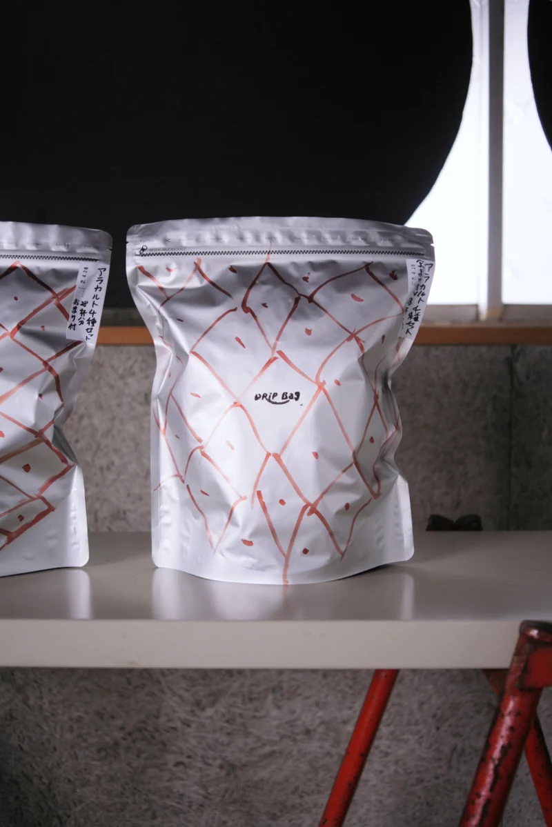
What appears here is “70% reproducibility.” Differences in understanding, right- or left-handedness, pressure, speed—the body and its reading show up in the pattern. Like the faces of kokeshi dolls, each unit differs slightly. It is mass production, yet each keeps a face, while the differences between patterns remain legible. We step away, on purpose, about 30% from the near-100% sameness of industrial packaging. Then the idea of “failure” softens and disperses. Ink spatter, a trembling line, an unexpected margin—these are not defects but traces of the hand passing through, supporting the density of the surface, making any sharp split between failure and success hard to draw.
I hold two poles of method in mind. One is the “accumulative” mode: redraw lines on a computer, tighten a radius by single degrees, stack copy-and-paste until precision peaks. The other is the “whole-grasp” mode: seize the composition at once, like exposing a photograph, finish with strokes and carving that do not allow retreat. Folk-toy painting, ceramic brushwork, calligraphy, wood carving, the patterns of ancient pottery—across places and eras, this is a universal technique lodged in the body. If the former lets an image cohere by the integral of logic, the latter makes an image rise by the differential of the body. In our practice we shuttle between them: set the footing of the accumulative (process, price, hygiene, loss), then, at the moment of drawing, switch on the whole-grasp. Speed and variety—and joy—can live together there.
One step further and a horizon appears: design without a designer in the loop. We design the “method (structure)” and hand it to the site. It will not collapse no matter who draws—and yet it will never be identical no matter who draws. Design shifts from “ownership” to “sharing.” An emblem of this shift was a new package of orange grid with dots. Mr. Yamaguchi bricolaged elements I had offered over time and composed it with his own hands. When he contacted me afterward—“I’d like to go with this”—I had already seen it on the shelf, and thought: something interesting is happening.
To understand the other’s domain, and still, at the point of a concrete question, to move one’s hands while asking “How would I answer this?”—that posture already resembles a relation of apprenticeship. In the usual client–designer pairing, hierarchy tends to harden; once the method is handed over, that structure tilts. The design of ISKOFFEE is, little by little, no longer mine.