Preface.
–
久しぶりに絵を描く仕事だった。
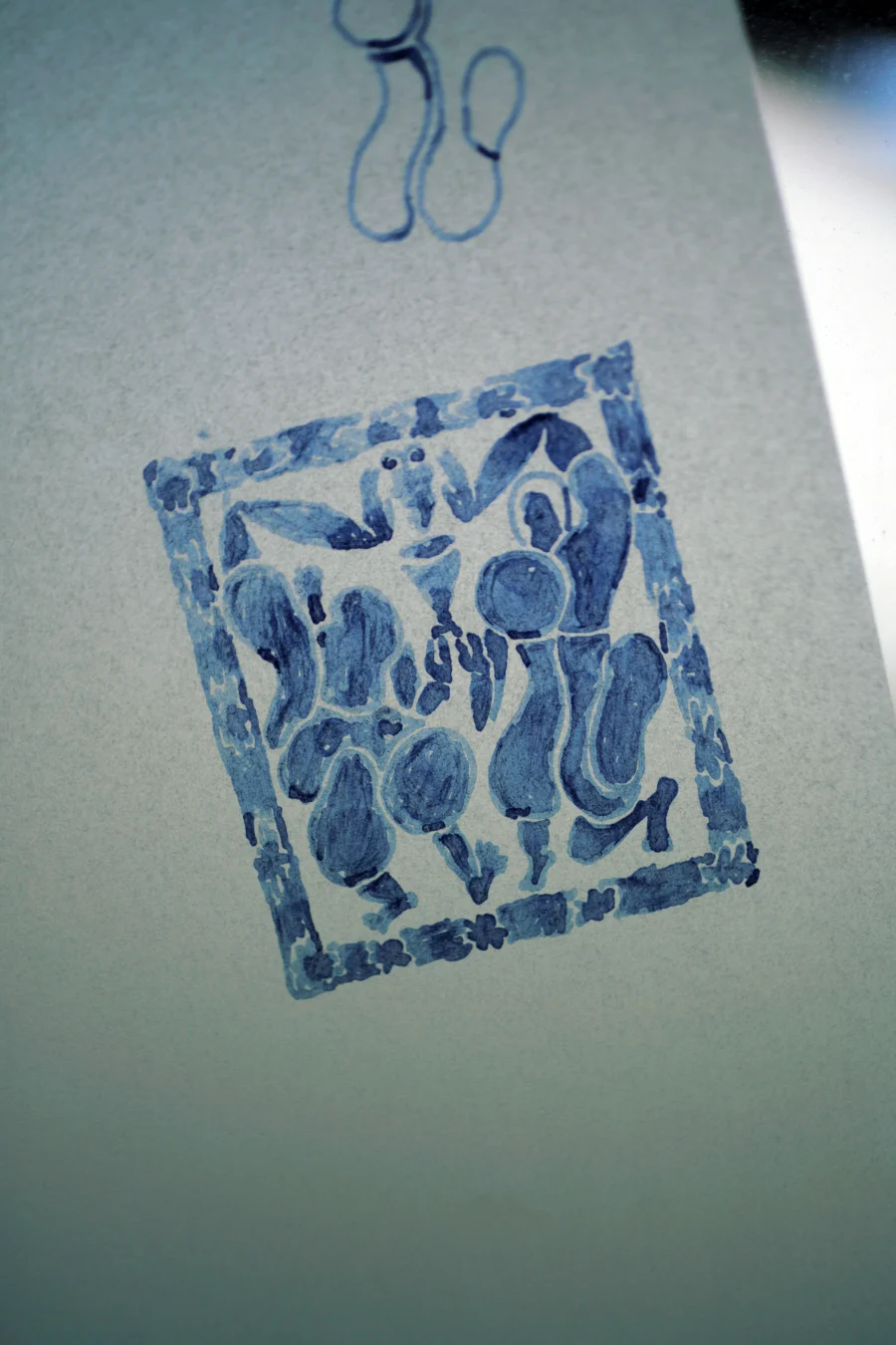
「Local」「Natural」「Convivialité」を理念に掲げる、ワインフェスティバルのビジュアルアイデンティティである。三つの言葉を直接図像へ置き換えるのではなく、象徴が立ち上がるための条件へと分解し、それらを組み合わせながら形を探ることにした。
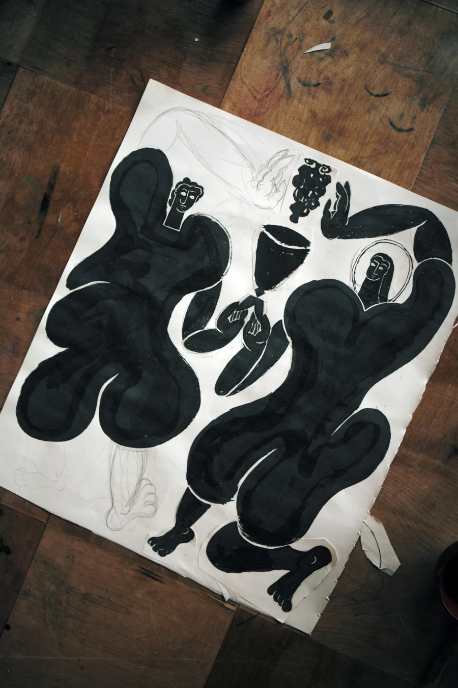
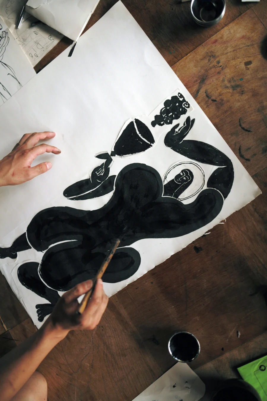
最初の条件は、描くための道具と素材である。葡萄やワインのみずみずしさを線の性質へ置き換えるため、筆と墨、万年筆とインク、紙など、水分を含み、流れ、にじみ、重なる画材を選んだ。完成形をあらかじめ正確に描くのではなく、手の動きと画材の振る舞いによって、形が生まれる状態をつくった。
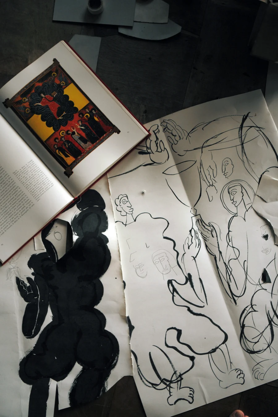
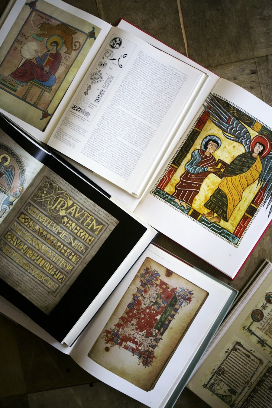
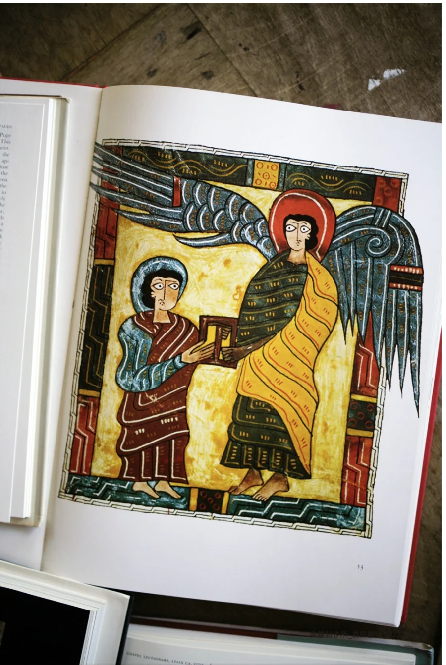
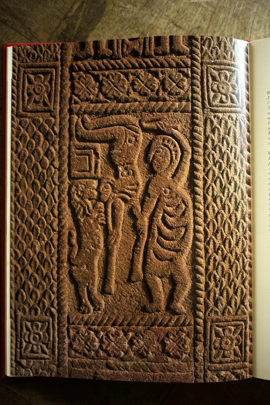
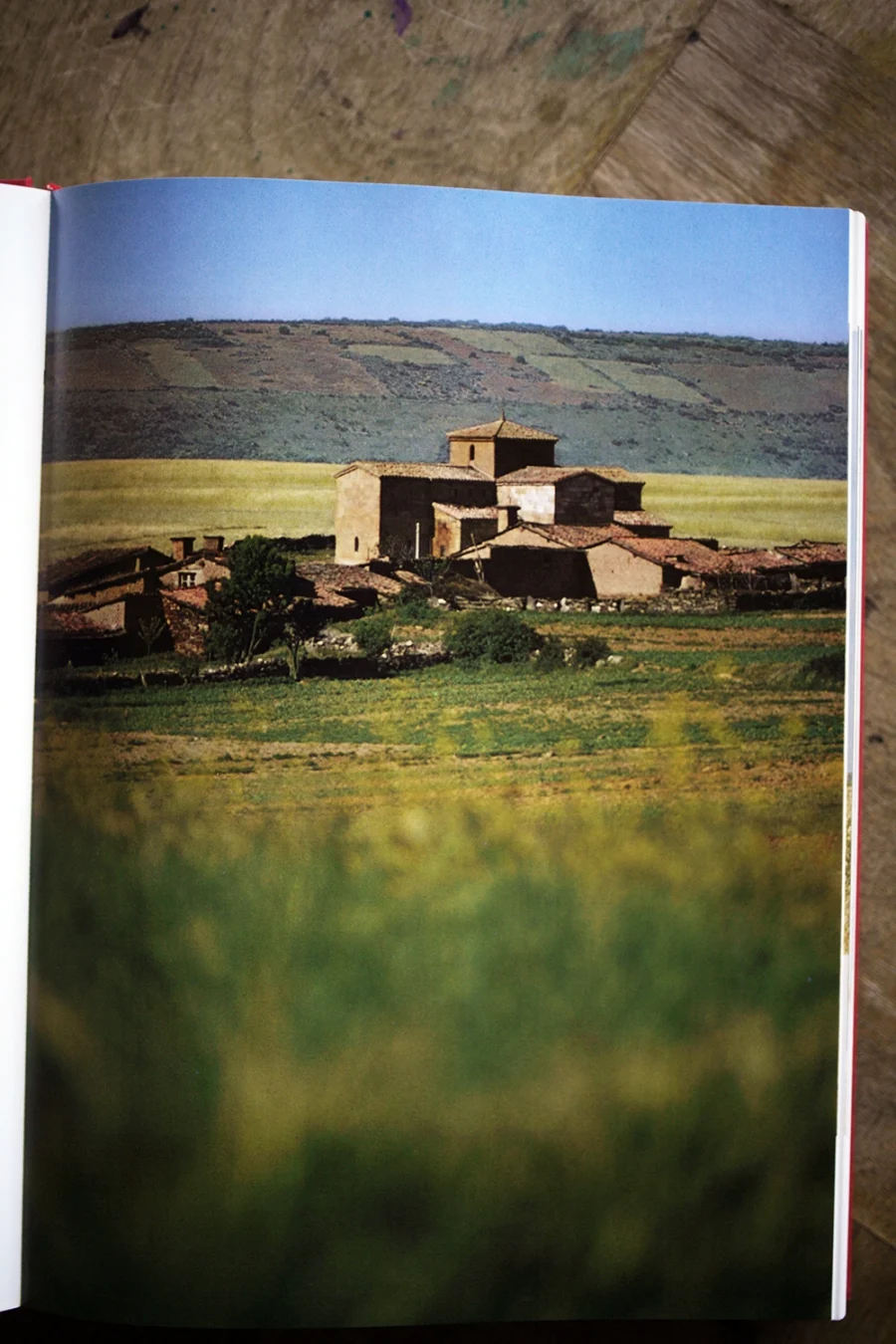
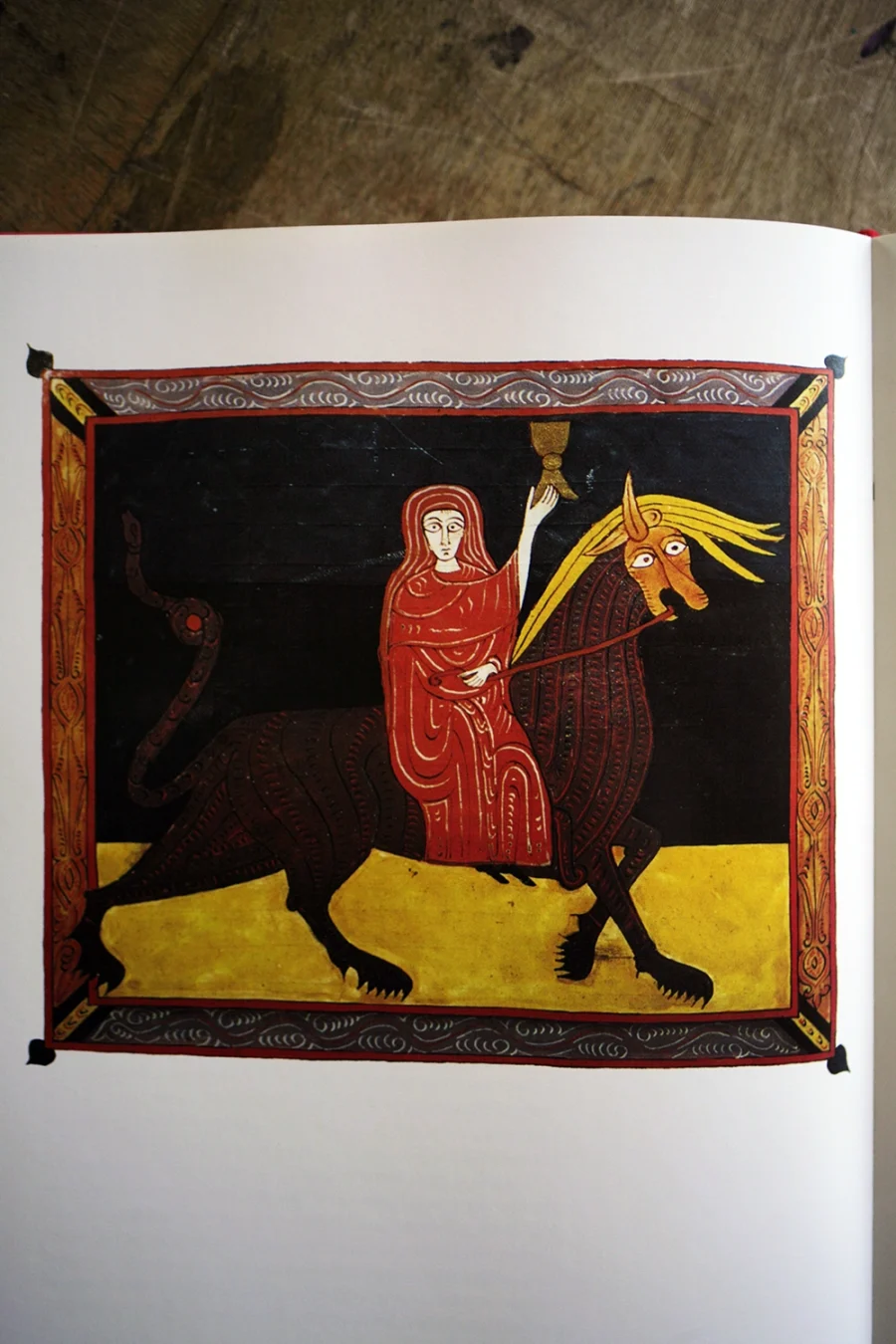
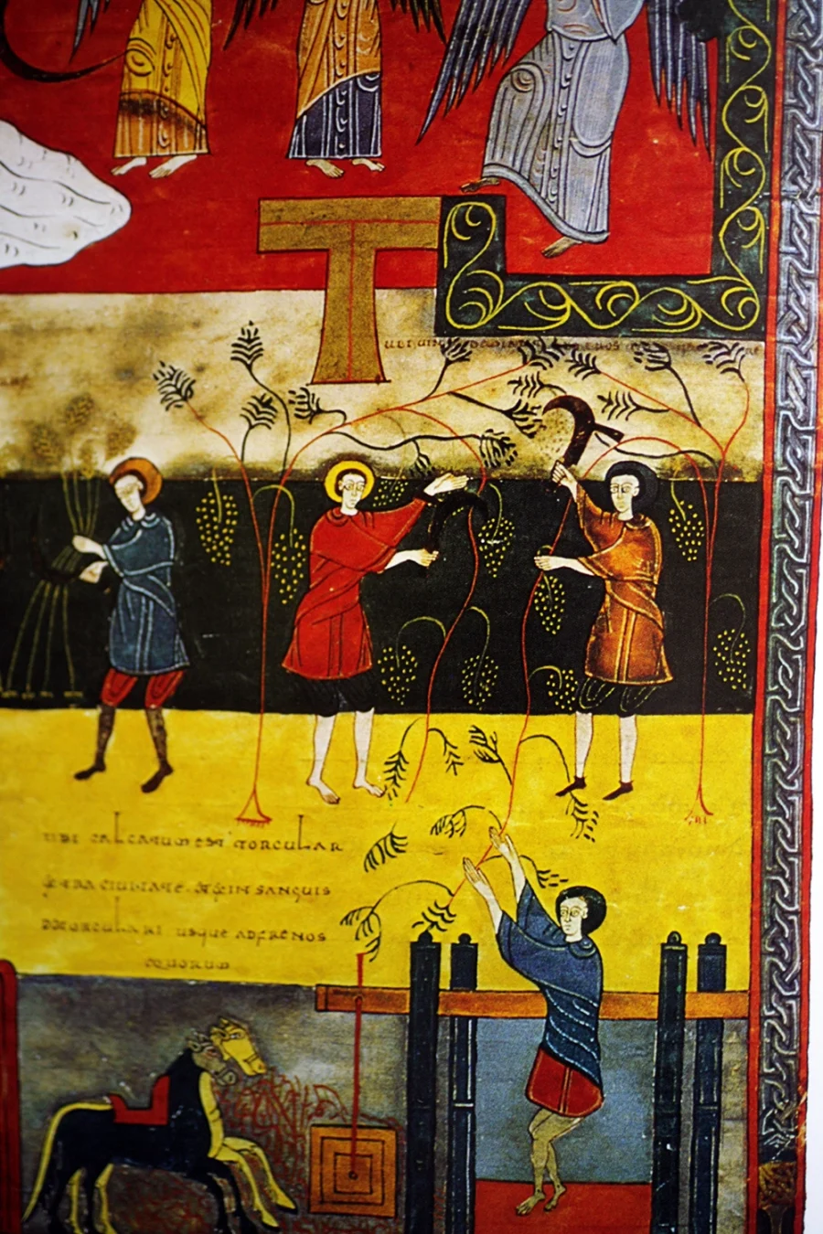
次の条件は、図像のリサーチである。ワインと共食を手がかりに古い聖書写本を調べると、杯を掲げる天使や騎手、葡萄を育てる農夫、制作を終えて祝杯を挙げる写本制作者たちの姿が見つかった。主に参照したのは、キリスト教の図像と、それぞれの土地の視覚文化が混じり合ったスペインやアイルランドなどの写本である。
過去の図像をそのまま引用するのではない。それらを現在の場所と自分の手に通すことで、別の形へと変換する。文化の固有性は、純粋な起源にあるというよりも、異なるものがその土地でどのように混じり合うかに現れると考えた。
最後の条件は、複数の理念を一つの象徴へまとめる構成である。フェスティバルの理念を「筆記用具」「リサーチと制作手法」「モチーフ」の三層に分け、それぞれを組み合わせながら、シンボルとロゴタイプを試作した。
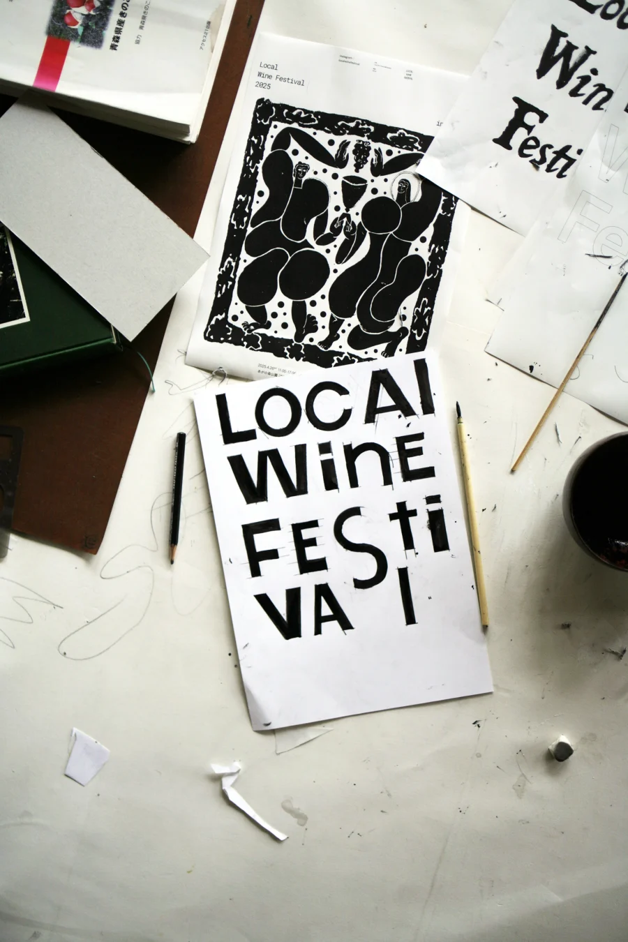
ロゴタイプでは、春のワイン祭りの軽やかさと、少し酔ったような揺らぎを表すため、鉛筆と定規で枠をつくり、その内側へワインを注ぐように墨を流して文字を描いた。
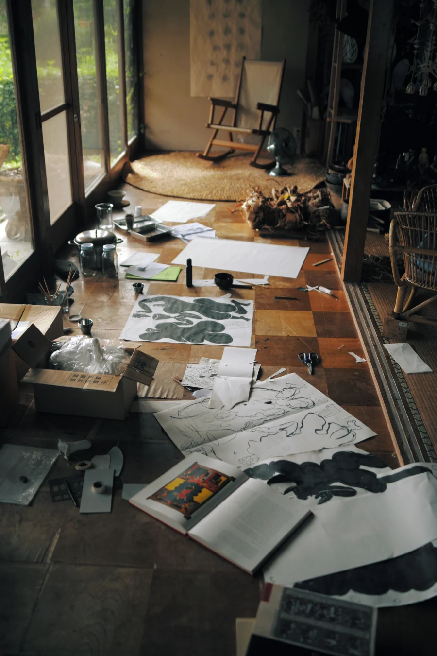
象徴を直接デザインするのではなく、象徴が生まれうる条件を先に設計する。道具、図像、身体の動きの関係を組み替えながら、そこに現れる形を見定めるためのプロトタイピングである。
—
It had been some time since I had last worked through drawing.
This project involved creating the visual identity for a wine festival organized around three concepts: “Local,” “Natural,” and “Convivialité.” Rather than translating these words directly into graphic motifs, I broke them down into a set of conditions from which a symbol might emerge, then explored how those conditions could be combined through drawing.
The first condition concerned the tools and materials used to draw. To translate the freshness and fluidity of grapes and wine into the quality of the line, I selected wet media that could flow, bleed, and overlap: brushes and sumi ink, a fountain pen and ink, and paper. Instead of precisely rendering a predetermined form, I created a situation in which form could arise through the interaction between the movement of the hand and the behaviour of the materials.
The second condition was research into historical imagery. Taking wine and communal eating as points of departure, I examined illuminated manuscripts and found depictions of angels and riders raising their cups, farmers tending vines, and manuscript makers celebrating the completion of their work. I focused particularly on manuscripts from Spain, Ireland, and other regions where Christian iconography had become intertwined with local visual cultures.
The aim was not to reproduce these historical images. By passing them through the conditions of the present and through my own hand, they would inevitably be transformed into something else. I approached cultural specificity not as a matter of pure origins, but as something that emerges through the particular ways different influences intermingle in a place.
The final condition concerned composition: how several ideas could be condensed into a single symbol. I organized the festival’s concepts into three layers—drawing tools, research and methods of making, and motifs—and developed the symbol and logotype by repeatedly testing different relationships among them.
For the logotype, I wanted to convey both the lightness of a spring wine festival and a slightly intoxicated sense of movement. I drew a framework with pencil and ruler, then allowed the sumi ink to flow within it as though wine were being poured into a glass.
Rather than designing the symbol directly, I first constructed the conditions from which it could emerge. This was a process of prototyping relationships between tools, images, and bodily gestures, and recognizing the form that appeared among them.